

It’s no secret that websites should be mobile-friendly.
However, I still prefer desktop browsing when possible. Why? Because it’s often PAINFUL to use a mobile version especially if you need to perform something slightly more complex than finding out business hours.
So if I go online and come across a poorly optimized website, I leave, as many others do. That’s how businesses often lose potential customers because of that one encounter with a website that does not function properly on their phone.
If your website isn’t optimized for mobile, you’re missing out on a massive opportunity!
In this blog post, we’re going to dive into the mobile advantage and why it’s absolutely crucial for your business to have a mobile-optimized website. So, grab your coffee and let’s get started.
Before you begin: Why mobile optimization is important
Mobile usage is no longer a trend; it’s the new norm. Just look around – people are glued to their smartphones! Whether they’re searching for the nearest coffee shop, reading the news, or shopping online, mobile devices are their go-to companions.
By optimizing your website for mobile, you’re aligning your business with this digital shift. You’re saying, “Hey, we’re right here where our customers are.” It helps you stay competitive in today’s fast-paced market.
Better Conversion Rates
We all know that conversions are the lifeblood of any business. Whether you’re aiming for online sales, lead generation, or simply getting visitors to contact you, a mobile-optimized site can significantly boost your conversion rates.
Think about it: a user who can easily fill out a contact form or make a purchase on their smartphone is more likely to do so. Don’t miss out on those crucial moments when your potential customers are ready to take action.
Google Loves Mobile Optimization
Guess who else loves mobile optimization? Google! The search giant gives priority to mobile-friendly websites in its search rankings. In other words, if your site isn’t mobile-responsive, you’re probably missing out on valuable organic traffic.
A mobile-optimized website not only ranks better in search results but also benefits from Google’s Mobile-First Indexing, which means Google primarily uses the mobile version of your site to determine its ranking. So, if you’re not mobile-ready, you’re falling behind in the digital race.
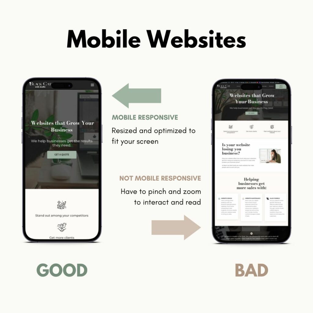
What does it mean to have a mobile-friendly website?
Imagine this: a potential customer stumbles upon your website while on their smartphone. If your site is not mobile-friendly, they’ll likely have to pinch, zoom, and squint to read your content or navigate your pages. Frustration sets in, and they’re bouncing off your site faster than you can say “responsive design.”
On the flip side, a mobile-optimized site ensures that your content looks sharp, loads quickly, and is easy to navigate on smaller screens. It’s all about providing a seamless, enjoyable experience for your visitors. Happy users are more likely to stick around, engage with your content, and convert into loyal customers.
Features of a mobile optimized website
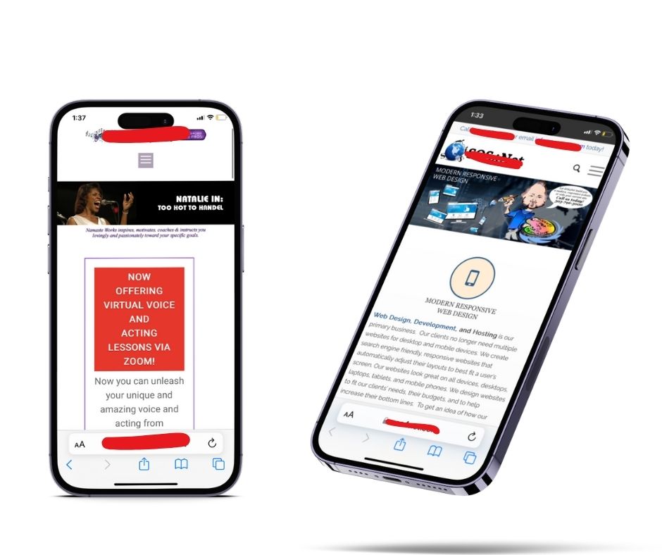
1. It should look nice on mobile.
Yes, simple as that. Elements should stay properly aligned, spaced and pictures should look as they suppose to. What often happens is that due to different screen resolution, mobile would display things awkwardly.

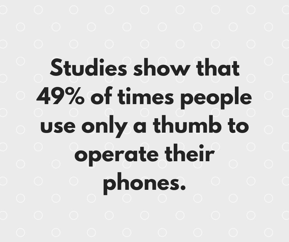
2. It is functional and easy to use.
I always think I have small fingers until I try to click the link on a poorly designed website that requires impossible finger acrobatics to navigate. It is frustrating.
Links and buttons should be sized appropriately for easy navigation on touchscreens. There should be enough space between the links so your visitors can easily access whatever they click on.
3. Stay legible.
Let’s say it straight – font size 14 is not okay on any part of your website. Nothing less than size 16 is acceptable as a body font size. Even then we should remember that some fonts are smaller than others and going up to size 18 is possible to allow people to read without straightening their eyes.
Conclusion: It’s Time to Go Mobile!
In today’s digital age, having a mobile-optimized website isn’t just a “nice-to-have” – it’s a must-have. It improves your visitor’s experience, boosts your search engine rankings, and ultimately helps you achieve your business goals.
Don’t let your competitors steal the mobile advantage – get started today and watch your business thrive in the mobile era!
Ready to take your business to the next level? Contact us now, and let’s make your website shine on every screen!